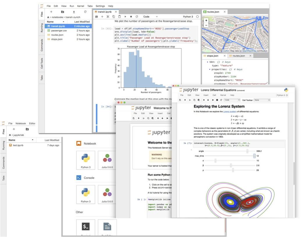
Part of the Atmosphere Virtual Lab (AVL) is a pre-configured jupyterlab python environment that can be used to analyze and visualize atmospheric earth observation data.
It is specifically designed to be used within a cloud environment, close to the data. But it can also be used on a local computer.
To install the AVL environment simply create a new conda environment and install the atmosphere-virtual-lab package.
$ conda create -n avl
$ conda activate avl
$ conda install -c conda-forge atmosphere-virtual-lab
$ jupyter lab
Or install the atmosphere-virtual-lab package inside your existing jupyterlab conda environment to extend its capabilities.
The key feature of AVL is, however, its visualisation functionality.
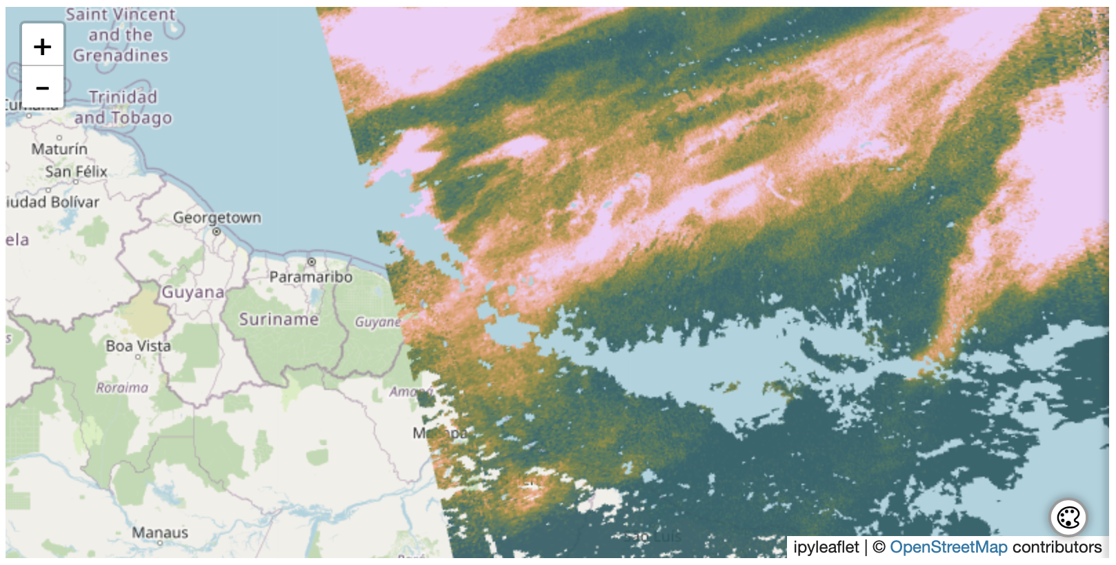
The AVL jupyterlab environment provides the capability to plot satellite pixels using the actual geographic footprint of the measurement.
Instead of converting the data to a raster image, AVL comes with the capability to plot millions of polygons as a single layer within leaflet plots.
To achieve this, two new Open Source components, leaflet-gl-vector-layer and ipyleaflet-gl-vector-layer-plugin, were developed.
The AVL jupyterlab environment provides a simple high level API to allow plotting the result of a HARP ingestion using just a single function call:
l2product = harp.import_product('S5P_OFFL_L2__SO2____20210412T151823_20210412T165953_18121_01_020104_20210414T175908.nc', operations)

avl.Geo(l2product, "SO2_column_number_density", colorrange=(1, 8), colormap="batlow", opacity=0.9)
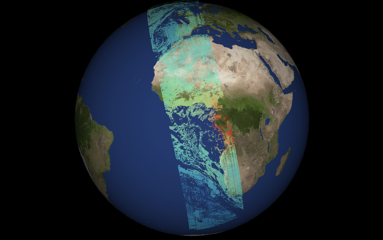
In order to better view data that covers the full globe, the AVL jupyterlab environment also comes with an interactive 3D Geographic Plot.
Creating this is just as simple as creating a 2D plot:
tropomi_co = harp.import_product("S5P_OFFL_L2__CO_____20220718T123656_20220718T141826_24674_03_020400_20220720T110230.nc", operations, options="co=corrected")

avl.Geo3D(tropomi_co, "CO_column_volume_mixing_ratio", colorrange=(0, 200), colormap="rainbow", opacity=0.7)
Examples can be found in the more recent Atmospheric Toolbox Use Cases.
Source code of AVL can be found on GitHub and for feedback and support please visit the AVL section of the Atmospheric Toolbox Forum.